Floatplane iOS app
Floatplane.com is a service that Linus Media Group builds after the pre-release platform, Vessel, was shut down after Verizon acquired them. The idea of floatplane.com is to host similar services as Vessel, meaning the ability to host videos with higher quality than what YouTube can host and allowing creators to get paid directly for their content without running ads on their videos.
The current website is in the Alpha stage, and many things will change before it runs in its full planned capacity. Since they are full at work on the website, they have no immediate plans to make any iOS or Android apps of the service.
This is a design exploration of what an iOS app for floatplane.com would look like.
Current Website
In the current version of the website, you can scroll through the feed of the creators you have subscribed to and watch, comment, and download videos. You also can manage your subscriptions and change your settings, such as security settings and billing.
Research
I looked into the various video apps available on the App Store to find inspiration and see what features and flows I could use. I did this since there is no point in reinventing the wheel, and you can always use the good parts of what is already out there when it comes to flows and interactions.
Ideation
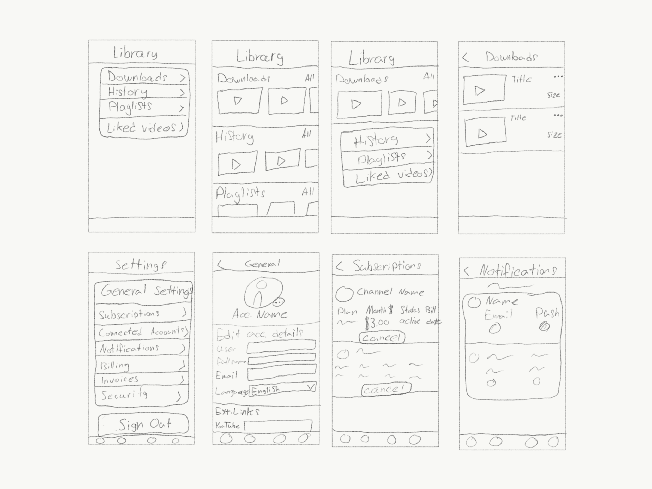
I always start my ideation by sketching out wireframes. It is faster for me to scribble down my ideas with a pen to validate and map out my ideas than to go into Sketch and start pushing pixels. I can try out a quick concept within a minute instead of spending 10-15 minutes making the UI on my computer. I used the current website features and took inspiration from my research to find concepts that worked.
Iterations
Just like any project, you never nail your design on your first try. Apart from sketching out my ideas into wireframes, I also tried it out with the more developed design system that I built about the current design on the website.
Architecture Map
The goal of the architecture map is to display the overall structure of the app and see the app “zoomed out” to get a good grasp of the actual navigation. The goal is to make the general navigation as logical and straightforward as possible. The purpose is to create an app that is easy to use, not just something that looks cool and has fancy animations.


